Tuesday, November 1, 2011
Week 4 Lab Write Up
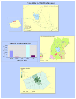
The lab from week 4 was my first time ever being exposed to ArcGIS and I can honestly say that I found parts of it truly fascinating, yet some parts of my first experience working with ArcGIS were equally frustrating. At first glance, I found ArcGIS to be a truly amazing way to organize geographical data. I found the layering set-up of the data sheets to be completely ergonomic, as it simplifies the process of observing data on multiple forms and lays it out in a more pleasing visual layout. I also liked how simple it was to transfer data from one data sheet to another, allowing the construction of multiple images of the same thing in order to show different trends and impacts at a specific geological site. However, I did find it painstakingly frustrating how different data layers have to be backed up and saved as separate files through the process of exporting data layers, rather than having them readily accessible from within the program software itself. I had the same experience with tables and charted data. I found it amazingly simple how ArcGIS was able to compile various data into a single table and represent it graphically; however, searching through hidden files for the data layers was obnoxious.
I also found that the alternate data and layout views were serious helpful when organizing data. I really liked how the layout page was an accumulation of all of the images and graphs created on one ArcGIS spread, yet the program, under data view, allows you to alter the data of one image at a time (and the screen shows just the image being edited). I found this as a logical way to organize data and separate the focus of each individual image and graph. However, when in layout view, I found it irritating how the ArcGIS commands were not the same as standard Microsoft Windows commands. For example, on a typical computer, when you use the scroll on the mouse, the page scrolls from top to bottom. However, when using ArcGIS, the images zoom in or out. And in layout view, if one image is accidentally selected, that image alone will zoom in or out, which distorts the layout that you have already positioned. I wish that there were a way to lock images on the page unless you specifically command the program to edit them (or if this option already exists within the ArcGIS software, it would have been nice if the tutorial had mentioned it).
One thing that I both loved and hated about ArcGIS was the methods through which images are visually edited. I liked how ArcGIS allows for colors of data layers to be altered by either creating a separate color scheme for a range of data or by using contrasting colors for different layers on the generated image. However, I felt like the program took too many steps to reach the pages, or property windows, within the program that allow for color change. For example, right clicking properties, and finding the frame tab, and then altering the color in order to simply change the background is not as simple a process and as user-friendly as changing the background on a Microsoft Word document. I found the same frustration with changing the font size of inserted titles. For some reason ArcGIS was not allowing me to change the size of the font on the same page that I wrote the title on (even though it clearly displayed the font size with a down arrow next to it), so I had to go another route, using the drawing toolbar, highlighting the title, and then editing the font size using the drawing toolbar. It just seems like too many steps in order to simply edit a title.
In all honesty though, the only pitfalls that I can currently find with ArcGIS are centralized around the basic operation of the program and the way that the program requires one to perform certain tasks (maybe after I complete more than just one lab I will have a better idea of pitfalls outside of the software itself). However, even after just one lab, I can already see a massive potential for the use of ArcGIS. The way that data is compiled in the program is truly amazing and it makes complex information readily accessible and interpretable by and to anyone. Prior to taking this course, I did not have much of a grasp of geospatial information systems, thinking that it was only used to make maps. But after one tutorial with ArcGIS, I’m struggling to find a field of study/expertise/etc. where ArcGIS could not be used to convey information about location. I find that ArcGIS is an efficient way for information compiled by specialists to be shared with a group of people that do not necessarily contain the skills and knowledge necessary to interpret overly technical data, or the general public. While making a project in ArcGIS may be time consuming and have multiple steps, it is for this reason that I believe that is ensures the creation of images that portray only legitimate information. My reasoning behind this thought is that operating ArcGIS requires a degree of skill and knowledge as well as a vast amount of time and, unlike a post on the internet on a site like Wikipedia, which can take all of five minutes, the amount of time that an ArcGIS project takes I feel like should deter people from using the program to spread false information. Furthermore, ArcGIS inputs data, not generalizations and unformulated conclusions. Any faults in a project would have to be found in the data itself. Overall, I believe that given the wide variety of geographical information that can be compiled and simplified using ArcGIS, that ArcGIS is a great tool for sharing information.
Subscribe to:
Post Comments (Atom)

No comments:
Post a Comment